 Last year, the ASQ journal Quality Progress published an article on the 7 new quality tools, meant as an update to the 7 classic quality tools known to many quality professionals (affinity diagrams, tree diagrams, interrelationship digraphs, process decision program charts, prioritization matrices, matrix diagrams, and activity network diagrams).
Updates should make things clearer and more useful. The updated version of the seven classic tools includes one -- data matrix diagrams -- that made things less clear, less useful and points out a danger of modern QI practice. QI can get too fancy for anyone's good.
If QI and its related processes are to really take hold in the social services, we need to keep things relatively simple. The quality managers we hope to use these tools need to be able to master them. The people who supervise these professionals need to understand what they are designed to do. The audiences for these tools need to be able to appreciate them. They need to be tools that can be spread from agency to agency and team to team. If we start teaching crazy complicated tools, techniques, and statistics and present them as "this is part of what you need to know," we can kill QI before it takes root in these agencies.
Social service folks are pragmatists. They need things that will make things better in their day-to-day lives. They will look at these ultra complicated tools and say, "this is beyond us," "I knew this was not for us," "these folks are nuts if they think we are going to take time out from our important, life saving work and learn this crap."
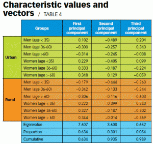
Take the following table from their example on data matrix diagrams. This one uses principal components analysis, a data reduction tool taught in many doctoral programs, to.. wait, I am unsure what the heck it is doing here. Here is the data set up they offered in the article: "100 potential customers (both genders of various ages in urban and rural areas) were asked to score five automobile features. A score of one was the lowest preference score, and 10 was the highest."
Show this to your juvenile justice program manager and see what her take home message is.
The use of quality data to improve service is a stakeholder issue. You use the data to show stakeholders what is going wrong and what is going right and where they can do better. QI suffers from buy-in problems. People don't want to be bothered. When QI folks take the time to show data to our stakeholders, it needs to have a message. It needs to be actionable. Showing social service folks tables like this will not boost the perceived value of QI in the social services.
The quality revolution in the social services cannot be by the academics, for the academics. The academic role is not to impress people with the fancy stuff we learned in graduate school. It is to point others to pragmatic tools they can learn and use on the job. At most, the QI workforce in the social services will have master's degrees and a class or two in statistics. They won't know principal components analysis or latent class analysis or growth mixture modeling and they don't need to. They need to know how to recognize when the data is telling them something is going well and when it is not and where things are going well and not.
They won't be data miners, making sense of data efforts that attempt to capture any and everything. They need to be measuring and monitoring the right things and applying the right tools to that data.

